Esurance Website Brand Refresh
Esurance redefined its position in the insurance industry by focusing on technology and innovation to create a simple, transparent, and affordable customer experience. This initiative included a website update with new fonts and a unique visual style for images on the homepage, product pages, and other sections. I led the redesign of the homepage and product page hierarchy, documenting all elements in a UI design system file in Sketch to ensure brand consistency as the design team developed new pages.
Explorations
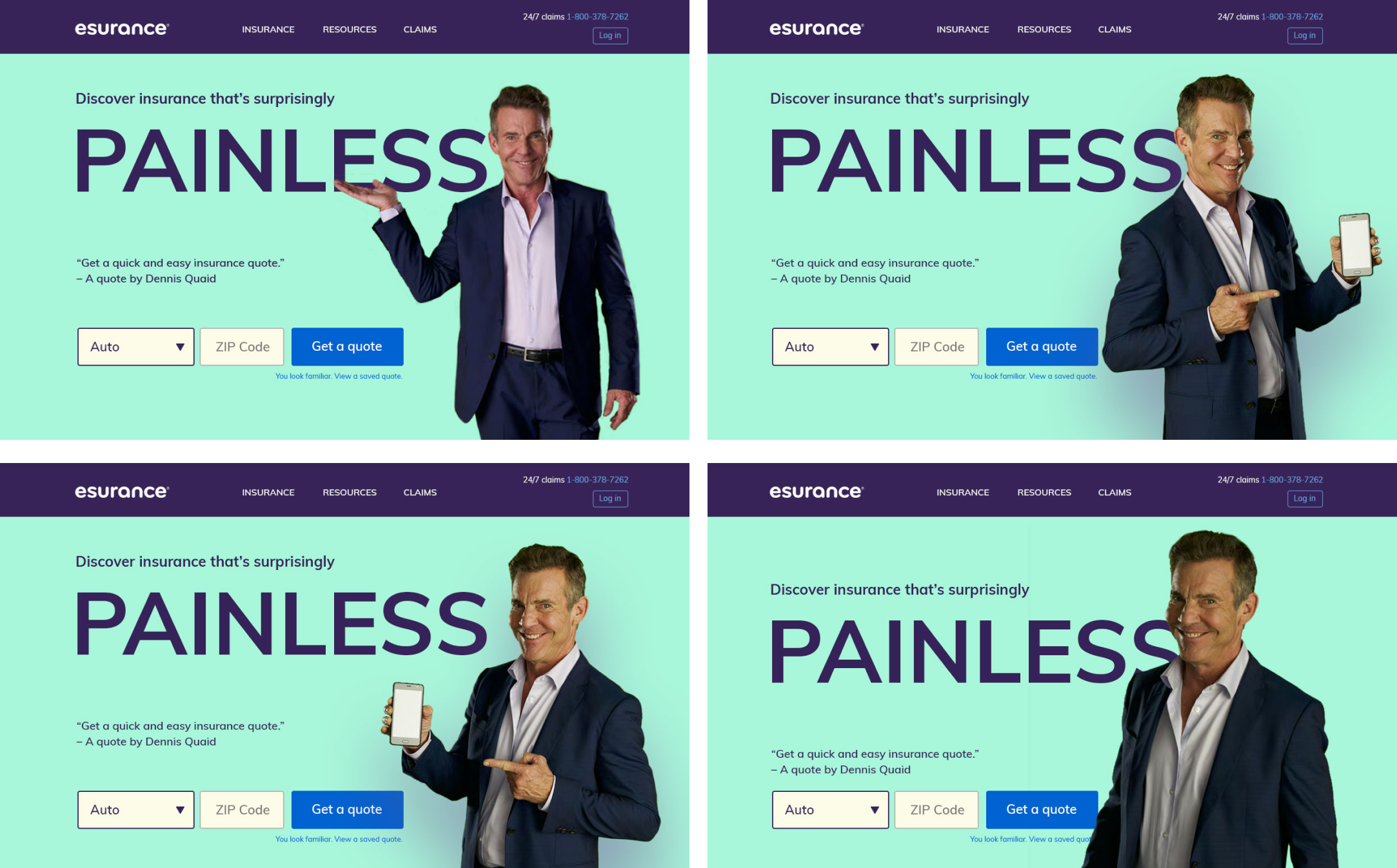
After selecting new fonts and colors, we explored different imagery options. Our goal was to steer clear of overly "stock" photos, but a custom photoshoot wasn’t feasible. Instead, we opted to isolate images against a mint background. We tested various types of imagery—people, objects, graphics, and situations relevant to the product pages. Ultimately, we focused on the human element, selecting photos with distinct personalities. We also developed a system for photo treatments to effectively showcase apps and images on our insurance partner pages.
^ Visual directions tested by user research and multivariate testing. The one on the left performed the best so we got to work making that style work across our site.
^ Photo explorations
Final designs and results
The broader color palette, minimalist font, and vibrant, clean illustration style enhanced the brand's personality and provided more options for user interface and interaction design. The rebrand positively influenced key marketing metrics, including a 4% increase in unaided awareness, a 3% boost in purchase intent, and improved quote completion rates. Users found the revamped homepage and interactions using the updated brand elements to be clearer and more intuitive.
UI Design System
I developed and managed a design system for the Esurance website’s UI, which encompassed font hierarchy, glyphs, button states and variations, form fields, and other recurring elements, complete with specifications and usage guidelines to ensure brand consistency. Created in Sketch, this system allows designers to easily use symbols, keeping everything aligned and cohesive.


